Baltimore Orioles Cartoon Bird Logo – Perfected
I recently received an email from graphic designer and fellow student of the Cartoon Bird, John Adsit, asking for permission to use some of the content I’ve chronicled in my articles. He had created his own version of the Cartoon Bird and was preparing a logo proposal to send to the Orioles front office. I of course said yes, but must admit I was a bit hesitant after seeing another “improved” version floating around the internet that was a far cry from the logos of the 60s, 70s and 80s. Besides, I didn’t necessesarily find anything wrong with the current logo and thought it was fine as is. However, after seeing Adsit’s version, my feelings quickly changed.
After looking through Adsit’s logo proposal, I must say, I was positively impressed! His logo is the perfect representation of all the logos from 1966-1988 and a clear improvement on the current cartoon bird. His presentation does a superb job of illustrating how much thought he put into the design, as well. Pouring over each detail, he points out the imperfections of the current logo by comparing it to the logos of the past and executes these changes flawlessly in his own version.
So, without further ado, I give you the perfected Cartoon Bird logo:
![]()
Compared to the current logo:
![]()
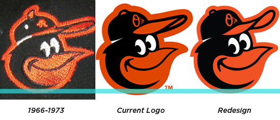
So how is this the perfect representation of the cartoon bird? The changes are very subtle so if you missed them on first glance, don’t beat yourself up. There are three big changes that I feel make this logo successful.
First, the Cap:
Adsit’s redesign is really just a combination of all of the past cartoon bird designs, focusing on the most prevalent logos with the longest tenures:

From top-left to bottom-right: Cap Logo 1966-1973, Cap Logo 1979-1988, Helmet Logo 1966-1988, Team Logo 1966-1991
The result is a new cap that looks like this

as opposed to this

The differences here are pretty obvious. The redesigned cap is less round, featuring a bill that flips up like the old logos used to do. The flipped up bill just makes things more fun somehow. With everything laid out in this way, its obvious that the current logo’s cap design falls short in accurately representing the logos of the past in this area.
Second, the Eyes:
Take a look a this collection of logos from 1966-1988:

One thing all of them have in common is that the pupils are very close to the bottom left corner of the eyeball. The current logo features pupils directly in the middle-left side of the eyeball. Adsit’s redesigned version corrects this problem by moving the pupils closer to the corner. It also features enlarged pupils mimicking some of the logos from the late 70s and making them more proportional to the overall size of the eyes. The result is an eye design that makes it look more like the bird is looking directly at you:

Third, the Outline:
This might be the most subtle of the three, but the current logo’s outline is a lot thicker than it needs to be. When looking back at the three cap/helmet logos with the longest track records, you see that their outlines are a lot thinner. Adsit’s redesign fixes this problem, bringing more of the focus back to the logo design itself. This comparison of the ’66-’73 cap logo, the current logo, and John’s redesign does a good job of pointing out just how overly thick the current logo’s outline is:
A Timeless Representation
These changes together with other small alterations make for a most accurate representation of the cartoon bird logo. With so many iterations of the cartoon bird, it’s no surprise that the first attempt to create an all-encompassing logo would fall short in perfecting a few of the details. However, in my opinion, graphic designer John Adsit has created the perfect version of the Cartoon Bird logo. He just nails it and knocks it out of the park. I’m especially impressed that he’s not trying to put his own personal stamp on the logo, just subtle changes that make perfect sense. Everything is still familiar and total respect is given to the logos of the past. He just wants the Orioles to have the perfect logo, and so do I!
Not sure what the politics and process are of getting a new design through to an MLB team, but it would be absolutely fantastic to see John’s logo make it onto the official caps in the next year or two. Let’s face it, the Cartoon Bird logo has gone through so many versions over the years (as the 1989 Orioles once said) “why nOt?!”
If you feel as enthusiastic about this logo as me, spread the word! Share this post with your friends or write the O’s yourself if you feel so inclined. You can check out John Adsit’s logo proposal on his website here. Good luck, John!


MUCH BETTER than the current. I like it !!!
Yeah, right?! I think what’s cool is that it’s not a drastic change. It’s still totally familiar, but those little details just make it so much better!
You didn’t fix my least favorite part of the new cartoon bird: the “O’s” on the hat. It’s far too small and finely detailed, so it doesn’t reproduce well when reduced and embroidered. Personally, I loved the smudge that all former cartoon birds had on their hats and wish that would come back.
Otherwise, excellent updates all around! Blast fax kudos!
Stumbled upon your interesting site. Would love to talk to you sometime. Back in the early 70’s I was the first person I know to start collecting ALL the authentic big league caps. LONG before they sold retail. It took a few years, lots of creative letter-writing to teams (pleading in some cases – “sorry, we don’t sell to the public”), finally getting all the caps in a collection. A friend built me a nice display case and I was the “talk of the town.” The Orioles, the AJD version, was the last one to come in in 1977 or 78, and the cartoon bird became my favorite cap. I’ve looked for YEARS to find the Wilson Orioles cap that you have! Any advise where I can find one?
Hi Dennis. I know there are several game used, sports memorabilia/auction sites out there, but I’ve had all my luck on eBay. Been a while since I’ve done it regularly, but there was a period where I’d do at least one search a day, everyday for Orioles caps. You really do have to be consistent about it. I have a very modest collection, but I’m happy with it. I think my holy grail would be either of the AJD caps. Those just don’t seem to show up at all. I’d like to build a display at some point. I’d love to see your collection! Send me a pic!
Thanks for your response. I’ll keep on eye out on ebay for a cap. The cap I got was a 1977 AJD with the white panel. The Orioles actually mailed it to me back then for free after I’d pleaded with them for over a year telling them that their was the last one I needed to complete my collection. Unfortunately, years ago during one of my many moves (I work in minor league baseball as a radio broadcaster) I gave my collection to a friend, who I’ve learned has passed away. I have no idea what became of the collection and I have no photos, just some really good memories of the endeavor. Thanks again.